
Creating a referral and rewards program that increased referrals by 20x
Context: SoFi is a fintech company that offers loans, banking, credit cards, wealth management, investing, and other financial products.


Experiment 1: Increased Referrals by 20x and Boosting New User Conversion
Applicable in: Fintech, SaaS, Collaboration tools, Consumer/Social
Problem: Referred users accounted for only 2% of SoFi’s new users. With the rising CAC (Customer Acquisition Cost), SoFi aimed to increase the number of referrals for their product as it's cheaper to acquire a new user via organic channel. Their challenge was to:
Decrease friction by making it easier for users to refer SoFI products to others.
Increase the visibility of referrals progress.
Increase motivation by creating an incentive that makes users want to do it.
Old Solution: The previous referral process was something similar to a typical referral program. Existing user shares a referral link from the app to a friend → friend joins SoFi app by signing up → referral gets rewarded when the friend finishes signing up. In this funnel, the only time a referral gets to know if their friend joined the SoFi app is when they receive the reward.
New Solution: SoFi product team implemented a simple solution of providing visibility to the referrer as their friends progressed through the sign-up stages during the referral process. This made it easy for users to understand what stages their friends are in and the potential earnings associated with each referral. This also encourages the user to refer more.
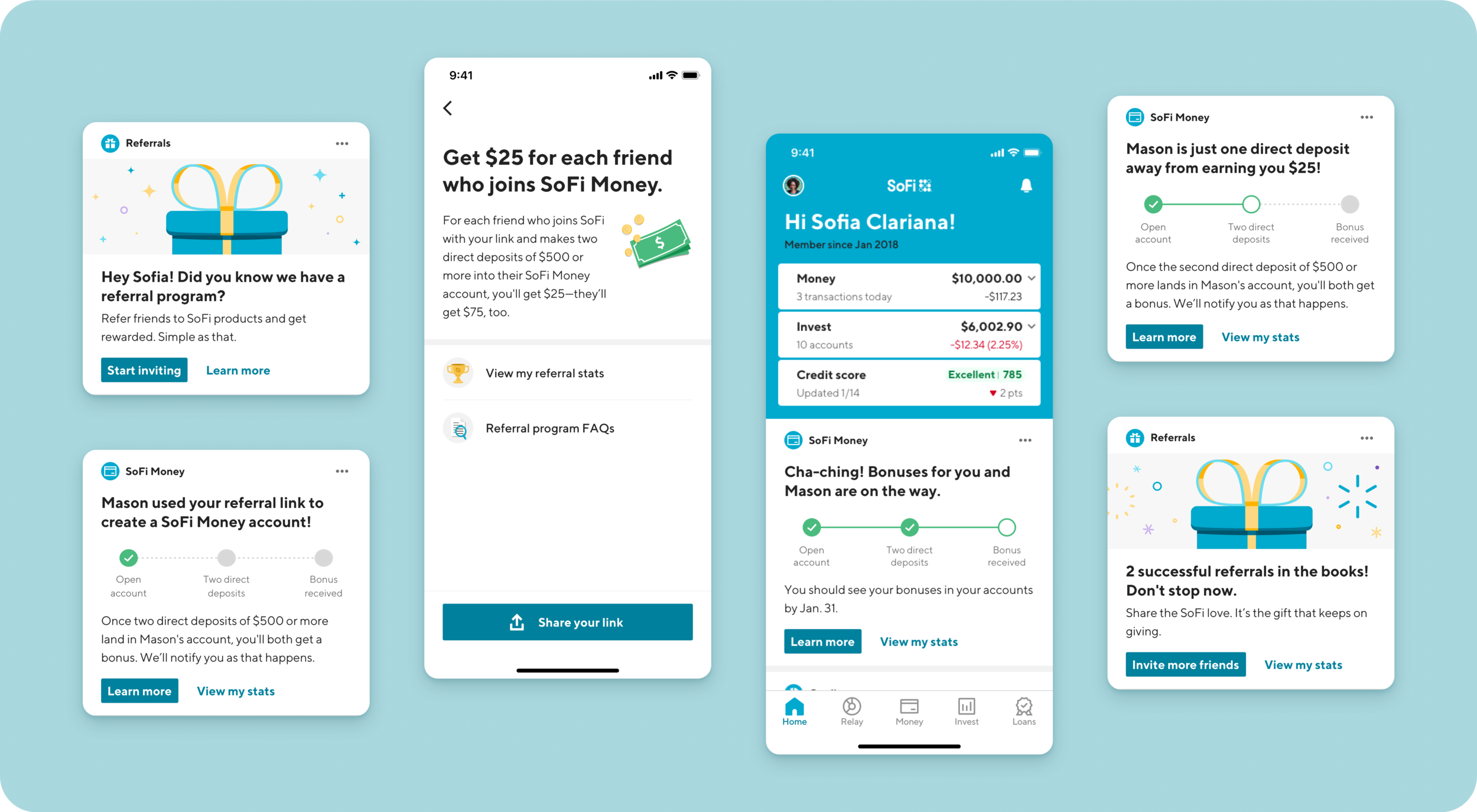
Impact: These changes led to a remarkable 20x increase in referrals, which accounted for 40% of all new user sign-ups within a 3 month period.
Learnings:
Providing clear visibility into the referral process and using financial incentives significantly boosted referral rates.
Transparency into the stage progression of their referrals encouraged the referrer to hold their referrals accountable.
Referrals can be highly productive and contribute substantially to user acquisition instead of typical ad spending.
Development Cost: 4 weeks
Experiment 2: Rewards Program for Encouraging Healthy Financial Habits
Applicable in: Fintech, Saas, Consumer
Problem: SoFi’s goal was to improve new user retention and cross-sell revenue by having users adopt multiple financial products. They needed a way to incentivize users to engage with their offerings and demonstrate healthy financial behavior.
Old Solution: SoFi initially lacked an effective mechanism to encourage users to adopt healthy financial habits. This was critical as it was directly correlated to retention, in turn the customer’s LTV (Life Time Value).
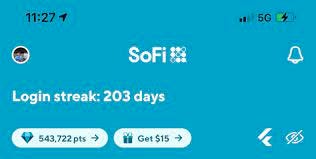
New Solution: SoFi introduced a rewards program that offered incentives for following healthy financial habits. Ex: Users earned $0.50 for actions such as logging in daily and maintaining a certain account balance. The rewards program was designed to be simple to understand. It encouraged users to deposit more money as they saw their account balances increasing daily while being conscious of their financial health.
Impact: This increased new user retention by 15% and cross sell revenue by 15x which made up significantly more than what SoFi spent ~ $15 a month (at $0.50/day) for the user.
Learnings on creating a successful rewards program:
Simple actions that are clear for the user to understand
Actions that can be done on a frequent basis to build healthy habits quickly
Tied closely with providing financial value to users that increased trust.
Development Cost: ~2 months
Experiment #3: Increased Free Trials by 20% with Increased Transparency on Your Mobile Pricing Page
Applicable in: SaaS, B2B, Consumer Subscription
Opportunity: The objective of this experiment was to increase the number of free trial sign-ups, in turn, the # of converted free trials at the end of the trial.
Old Solution: In the existing setup, the paywall page had four main components:
Title with a clear value proposition.
A list of bullet points outlining the features available during the free trial.
A clear Call to Action (CTA) to purchase.
Price point information.
An asterisk (*) explaining the terms of the free trial.

New Solution: The updated paywall page introduced the following components:
A timeline explaining how the free trial works.
Clarity on when the user will be charged.
A prominent CTA to start the free trial.
Indicator to show the user has already made progress towards the purchase

Impact: The implementation of the new paywall page resulted in a 20% relative increase in the number of free trial sign-ups.
Learnings:
Users tend to associate asterisks and small text with something suspicious, which can erode trust.
The #1 fear of starting a free trial is forgetting to cancel it - addressing this upfront helps build user trust.
Showcasing a user's progress in their software trial journey can make users excited and foster a connection with the product.
Listing all available features can sometimes overwhelm users and make them feel like they've wasted money if they don't use all of them.
Development Cost: 1 week.
Share your thoughts, feedback, or your own experiments in the comments section. 🚀
If you found this post valuable, consider sharing it with just one person who can benefit from these insights. Your support means the world to us. 🙏
Great article with many insights! Was just curious about a few things regarding Experiment #1 (SoFi's referrals):
1. Do you know if the impact (where referrals accounted for 40% of signups) was sustained after 3 months?
2. Are signups in this context referring to account opens or deposits?
Thank you for sharing!