
3 Onboarding & Checkout Secrets to Share
From Mural, Hubspot & a large ecommerce retailer.


Today, we're lifting the curtain on three powerful experiments from Mural, Hubspot, and a large E-Commerce retailer.
1. Minimizing User Shock on Checkout: Increased Revenue by $22M with just 1 day of engineering work.
Applicable for: E-commerce, Marketplaces , B2B, Fintech
Problem:
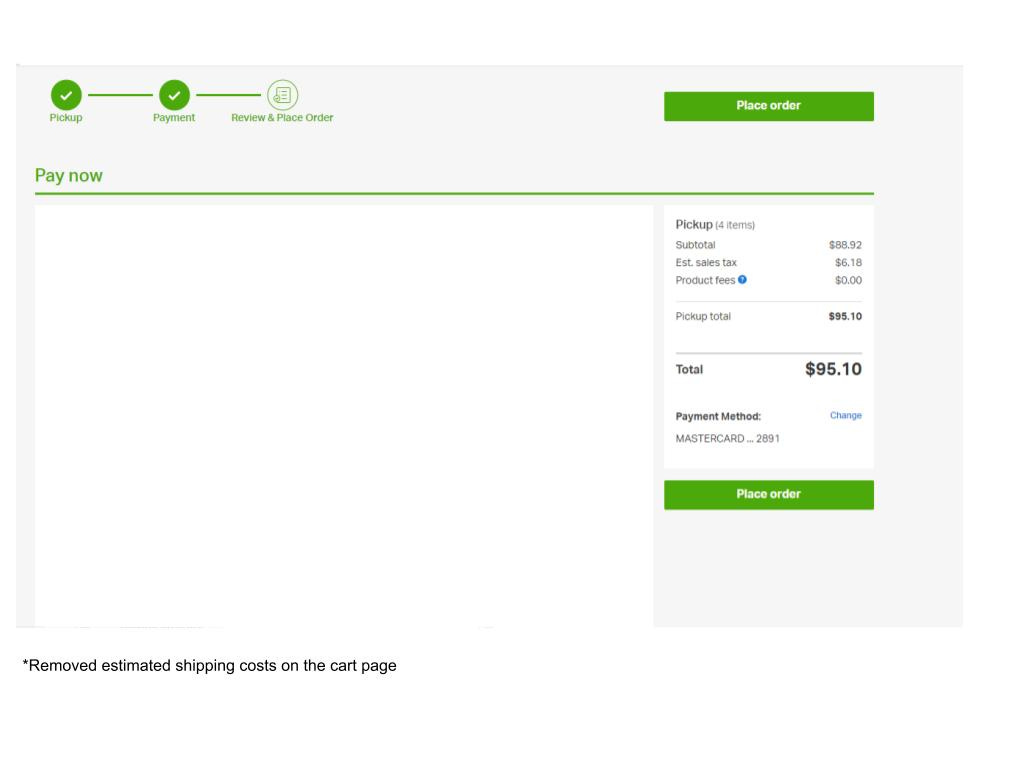
Users were unpleasantly surprised by discrepancies between estimated and actual shipping costs upon reaching the final checkout page. This inconsistency often led to cart abandonment. This company faced a challenge in the checkout process - the "shock factor."
Old Solution:
This company initially displayed the estimated shipping costs on the cart page and once they had the user’s billing address they displayed the “real” shipping costs on the final checkout page, but this experience created a shock factor for users because the price they initially saw did not match the final price they would have to pay.
New Solution:
This company opted for a bold shift in strategy. They removed estimated shipping from the cart page and unveiled these costs only on the checkout page. The surprising revelation was that users that would have been exposed to the higher shipping costs in the old solution, displayed a significantly higher checkout rate. This minor change delivered a colossal impact - an annual gain of $22 million, with a mere one-day of engineering cost.
Learnings:
The experiment unveiled an unexpected truth - for user purchases, detailed cost breakdowns upfront aren't as vital as delivering an accurate total at the right moment. Building trust through precision and minimizing user shock proved to be the game-changer.
2. Hubspot increased the # of KYC enrollments by double digit % growth:
Applicable in: Marketplaces, B2B, Fintech
Problem:
HubSpot was facing a common challenge in the payments industry: user resistance to switching to a new payment platform. To boost the number of KYC pros on their platform, they needed to either reduce the friction of the sign-up process or increase user motivation. This experiment focuses on the former - reducing friction of the sign up process.
Old Solution:
HubSpot had an MVP solution that required users to initiate the KYC process on their platform but redirected them to the Stripe website to complete personal details and link their bank account. User interviews revealed confusion around the need for a Stripe account to use HubSpot's payment tools.
New Solution:
Sophia Friend and her team kept the entire onboarding and information collection process within HubSpot's native UI, thus creating a contextual UX for their customers. HubSpot brought the KYC process in-house, eliminating the need to redirect users to a third-party website.
Impact:
The results were impressive - a remarkable double digit % (absolute) increase in KYC pros enrolling every week. This transformation was achieved with four sprints of development work, even with the high development costs the ROI was well worth it.
Learnings:
This experiment unveiled a profound lesson - Users tend to have greater trust in the brand and platform they're signing up for, in comparison to third parties that may lack trustworthiness in your customer’s eyes.
Example from Honeybook:

3. Mural's Retention Breakthrough: Simplified Onboarding increased 1 week retention by 10%+
Context:
Mural.co is a SaaS company offering a collaborative visual work platform designed to make teamwork more efficient and enjoyable.
Applicable for: B2B, B2C, Productivity
Problem:
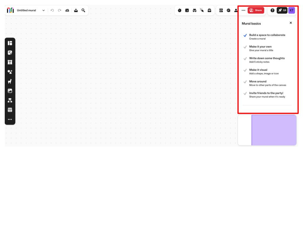
Mural faced a significant hurdle in its 1 week retention rate - new signups weren't engaging with their platform as expected. They aimed to create an onboarding experience that would guide users seamlessly into their first session and encourage them to take a “quality” action. In this case an example of “quality action” was when a user creates their first board or when they add a sticky note. This “quality” action was a leading indicator to retention.
Old Solution:
The initial approach consisted of app-cues, banners, chat, and pop-ups, leading to user confusion about where to start. Each of these modals had a specific action in mind for the user, but their simultaneous presence overwhelmed users, causing them to disregard these prompts since they didn't align with their primary goal on how they wanted to use the platform.
New Solution:
Mural conducted an experiment in which they turned off all the above UI treatments and introduced a streamlined checklist. This checklist, featuring just five items, became the user's guiding light upon landing on the platform for the first time. The focus on simplicity and clarity proved transformative as it helped users to focus on one item at a time.
Impact:
The impact was substantial, with a remarkable 10% relative increase in 1 week retention, making the onboarding experience more engaging and effective.
Learnings:
Mural's journey underscored the power of simplicity in onboarding. Providing too many directions can overwhelm users. When your product is straightforward, users can often figure it out themselves. By focusing on the basics and offering a single, clear starting point, you empower users to explore and learn. Sometimes, less hand-holding allows users to truly grasp how to use your product.
So, there you have it – three experiments transforming the game. Remember, growth is all about innovation and experimentation. Share your thoughts, feedback, or your own experiments in the comments section. Let's keep the growth conversation going!
And if you're hungry for more growth experiments, hit that subscribe button. Thanks for being part of the GrowthInsider’s community. Stay curious, stay innovative, and keep growing! 🚀
If you found this useful, it would mean a lot to us if you could share this 🙏
Until next time, happy experimenting!